Download Statistics for OGD (Canton of Zurich)
Posted on 2024-02-10 in opendata
Links
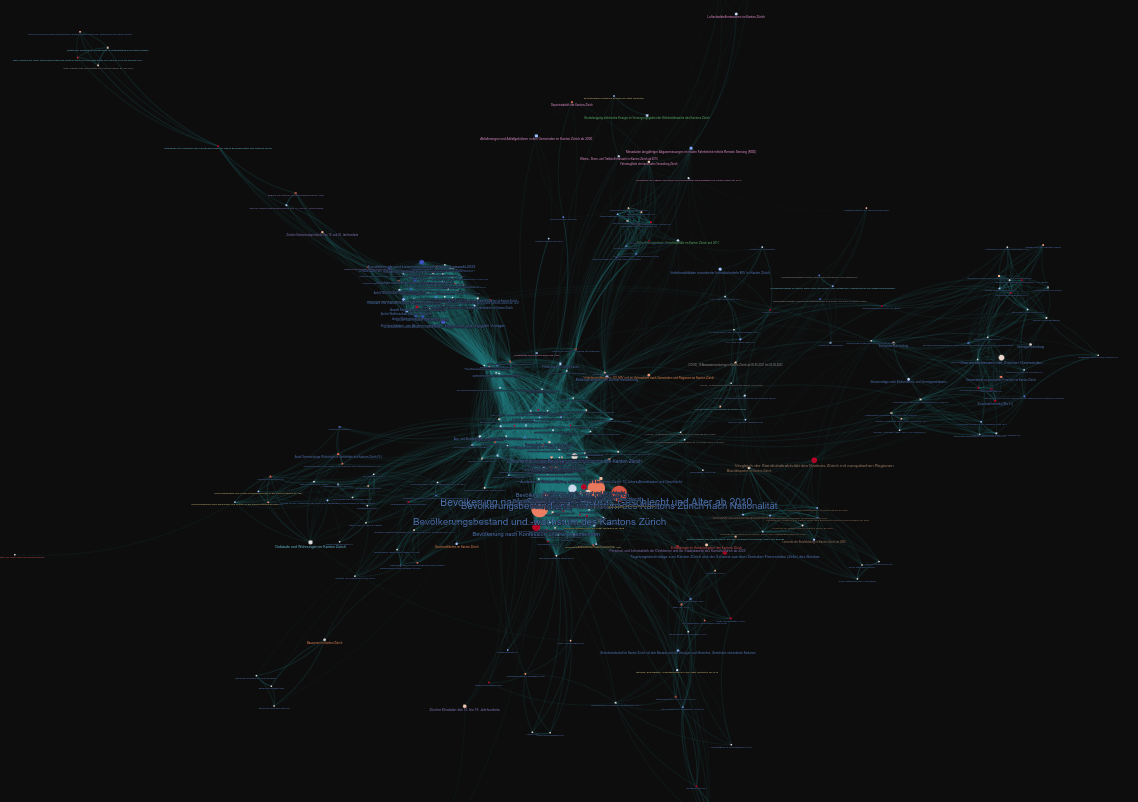
After my last post creating a network graph for the Open Data listed on opendata.swiss with Gephi, I searched for a solution to automatically create a nice looking graph. Luckily, I found a solution with:
NetworkX is used to calculate the graph and its x/y coordinates. The network is then exported to gravis' own Graph Format called gJGF.
The data is passed with gJGF to Gravis and the exported to an interactive d3 visualization.
Thanks to the gJGF, additional properties can be set like graph.metadata.background_color or node.metadata.hover.
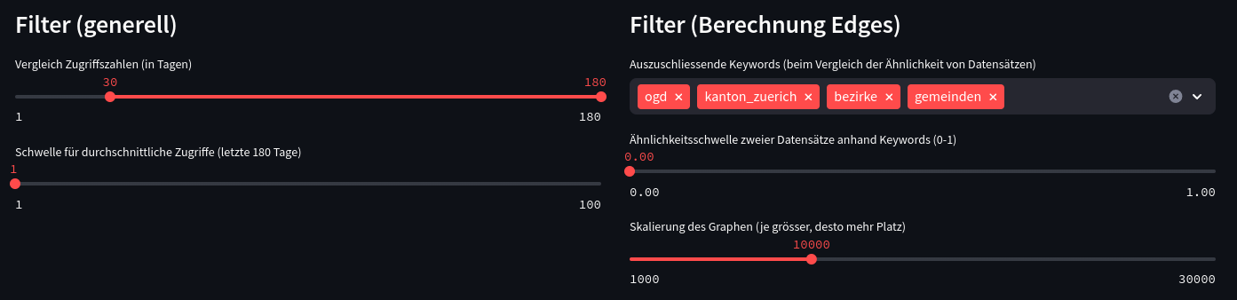
Streamlit makes it then easy to create a web application out of it with dynamic filters:
Lessions learned:
pandas.DataFrame.iterrows()can be very slow indeed (like stated here). But even when having to add multiple pandas operations to reach the same result, this solution can still be faster.- When calculating edges, the cartesian product can be generated and then be filterd with
df[df['edge_id_x'] < df['edge_id_y']]. This way, edges do not get inserted twice withnx.Graph.add_edge. Even the self-duplicate from the cartesian product gets excluded this way. - Colors from a colormap can easily be mapped to a DataFrame's values with
pandas.DataFrame.map({'value1': 'color1', ...}). - Coordinates from NetworkX have to be mutated to be readable by gravis:
pos = nx.spring_layout(G, iterations=200, scale=scale, seed=42)

# Add coordinates as node annotations that are recognized by gravis
for name, (x, y) in pos.items():
    node = G.nodes[name]
    node['x'] = x
    node['y'] = y
- Disable moving graph with
gravis.d3(layout_algorithm_active=False)